The Definitive Guide to Figma Auto Layout
Learn everything you need to know to master Figma Auto Layout and optimise your work. This guide is based on the latest Auto Layout updates released at Figma Config (May 2022).
Auto Layout is one of the most relevant features of Figma. It allows you to create dynamic frames that behave according to a set of customisable properties. With this feature, you can set attributes for alignment, spacing, and padding, among other properties that will adjust the frame to its content and vice versa.
This tool will give you the freedom to add or remove whatever you want from your layout and let the content adjust itself. You don’t need to calculate sizes, check if the alignment is in place, or rearrange all the objects whenever you want to edit an element – Auto Layout will do it for you.
Besides being a great tool to optimise the creation of layouts, Auto Layout also improves the organisation of layers and the consistency of your designs, which are huge factors when it comes to evolving your projects and collaborating with your team. And it’s for all these benefits that you should learn everything about this feature.
Let’s jump in!
Getting started
Once you select a frame or an object, you can add Auto Layout using the following 3 methods:
- click on the “+” button in the Auto Layout section in the right panel
- use the SHIFT+A shortcut
- right click on the selection and choose “Add Auto Layout”
The feature will be activated, instantly adjusting the frame and its content. You can also select multiple items and turn Auto Layout on. This will create a new frame with all the chosen objects inside it.
The Auto Layout properties will have default values when you turn it on, but they can all be customised. We’ll talk about each attribute from now on.
Exploring Auto Layout properties
Direction
The Direction will define whether the elements will be distributed horizontally or vertically. If it’s Horizontal, the items will be positioned side by side. And if it’s Vertical, the items will be placed below each other.
To change the Direction, you can use the arrows on the right panel as shown below.

It’s important to know that you can only set one Direction at a time. So if your layout needs stacks in multiple directions, you’ll need to nest Auto Layout frames. But don’t worry about that for now; we’ll talk about nesting later.
Padding
Padding will affect the empty space on the edges of the frame. There are two ways to set this property: Vertical and Horizontal Paddings or Independent Paddings.
If you set Vertical and Horizontal Paddings, you must enter two pixel values. The Vertical Padding will define the top and bottom margins, while the Horizontal will set the right and left ones.

Or you can set Independent Paddings, entering individual values for top, right, bottom, and left. In this case, you’ll enter four values. To do so, click the Independent Paddings icon to display all four input fields for each side.

You can change the Padding by dragging the handle directly on the canvas or inserting the values into the panel on the right.
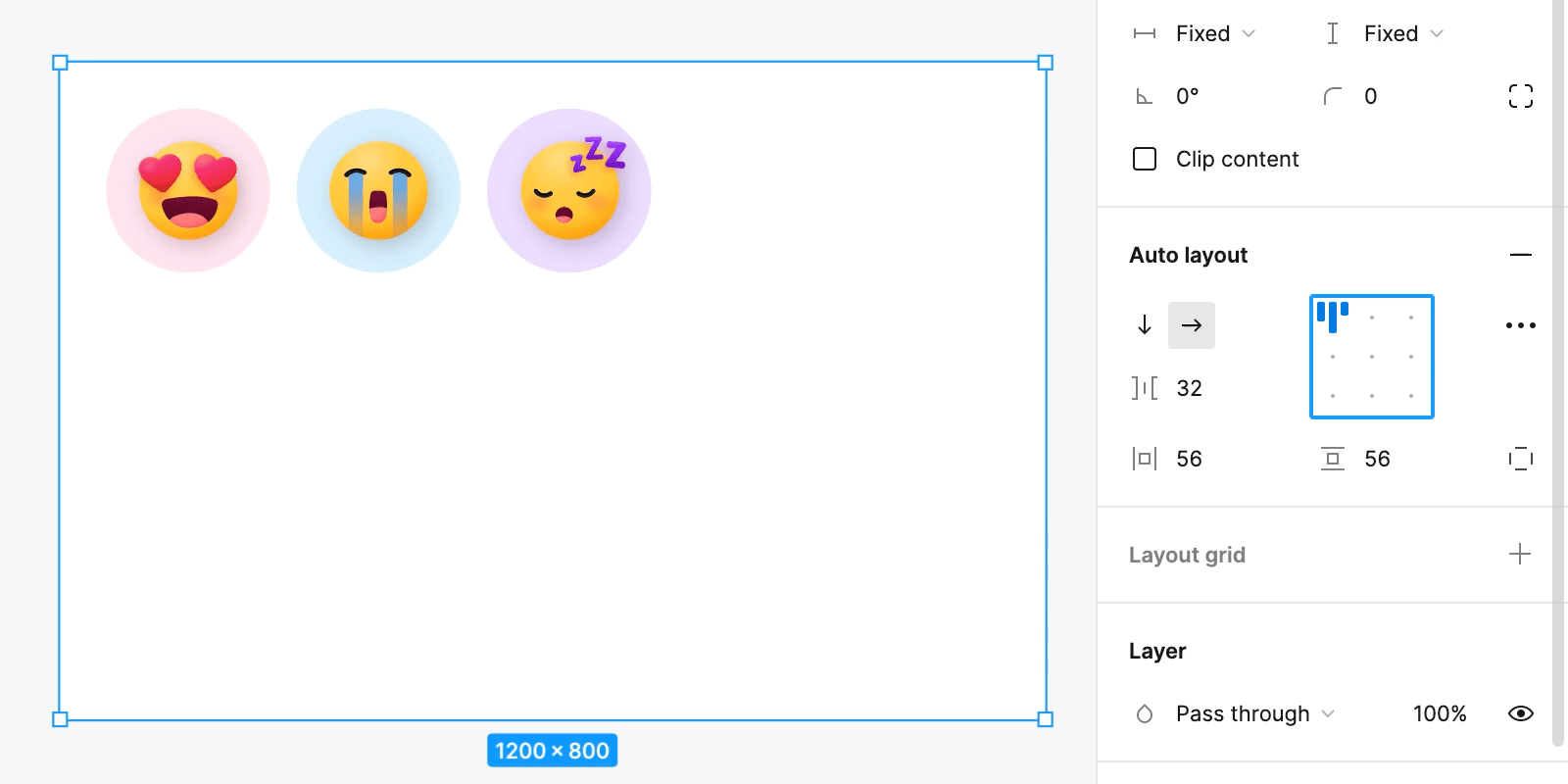
Spacing
Spacing is related to the distance between objects within a frame that has Auto Layout applied. The higher the value of this property, the more distant the elements are from each other.
When you set a value for Spacing, all elements within the frame will have that same distance from each other.

Like for Padding, you can also change the Spacing by dragging the handles directly on the canvas.
Alignment
The Alignment property will define the position of the elements within the frame. There are nine alignment options: Top Left, Top Center, Top Right, Left, Center, Right, Bottom Left, Bottom Center, and Bottom Right.
If the Spacing Mode is set as Space Between, you will have fewer options, as the objects will be distributed to fill the entire height or width of the frame. In this case, you will see only three alignment options available: Top, Center, and Bottom – if the Direction is horizontal – or Left, Center, and Right – if the Direction is vertical.

Resizing
Resizing, as the name says, is the property that controls the size of the elements. Resizing attributes are applied to both parent frames and child components, and are set separately for the height and width of each object. To edit this property, change the height and width settings in the right panel.

For a better understanding of all possibilities, let’s take a look at all the resizing attributes, one by one:
1. Fixed
When using Fixed height or width, the object’s dimension will be fixed, regardless of its content and/or its parent frame, if any.
In the example below, all the heights and widths have fixed sizes. See how, when we resize any object, the dimensions of others are not affected:

This attribute can be set for both parent frames and child components.
2. Hug contents
Using Hug Contents, the size of the frame will adjust to its content. This means that the size becomes dynamic and will shrink or stretch to hug all elements. The dimensions of all objects, Spacing and Padding will be considered when calculating the frame size.
In the example below, the parent frame has both height and width set as Hug Contents. See how its dimensions change when you resize child elements:

This attribute can only be set for parent frames or text containers.
3. Fill container
The last Resizing attribute is Fill Container. When an element has the height and/or width set as Fill Container, its size will be dynamic and stretch or shrink to fill the free space in the frame.
In the example below, the elements within the main frame have Fill Container set to their dimensions. See how they react to the parent frame changing size:

This attribute can only be set for child elements.
Spacing Mode
Within the Auto Layout section, you can access some advanced layout properties by clicking on the “…” icon. Among the options in this menu you will find the Spacing Mode. This is the property that will define the way of distributing the elements on the frame. It can be set as Packed or Space Between.
If you choose Packed, the elements will be distributed according to the fixed value you set for the Spacing property. That means they will be grouped at a fixed distance, regardless of the frame size.

If you choose Space Between, the value set for Spacing will be ignored, and the elements will be spread over the whole width or height of the frame, depending on the Direction chosen. In this case, the distance between the objects will be dynamic and affected by the frame’s size.

Remember that if the Direction is vertical, the elements will be distributed on the y-axis. And if it’s horizontal, they will be distributed on the x-axis.
Strokes
The stroke you add to an object in Figma is not considered part of its size. By default, the stroke is also ignored when setting the properties of an Auto Layout frame. That is, when you define the Padding and Spacing, the layout will be calculated without considering any stroke added to the elements.
If you want to consider the stroke size in your design, go to the Advanced Layout menu and in the Stroke property, choose Included in layout. The frame will be readjusted, considering the space the stroke takes up. This only applies to Auto Layout rules and does not change the actual size of objects.

Canvas Stacking
This is another property that can be found in the Advanced Layout menu. Canvas Stacking is related to the visual order of the layers in a stack.
If you choose First on top, the first layer will appear in front of the second and so on. If you choose Last on top, the last layer will appear in front of the others. This property is purely visual and does not affect the actual order of the layers seen in the left panel.
This property can be handy if you use negative Spacing and the objects overlap.
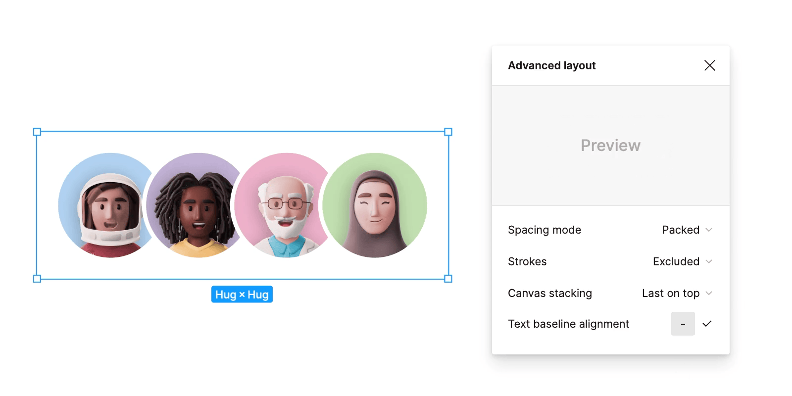
Text Baseline Alignment
The last property in the Advanced settings menu is the Text Baseline Alignment. With this attribute active, the layout arrangement will be guided from the text baseline, aligning all elements to it. Turning it on, you’ll only have 3 Alignment options available: Left, Center or Right; since the baselines will always be aligned.
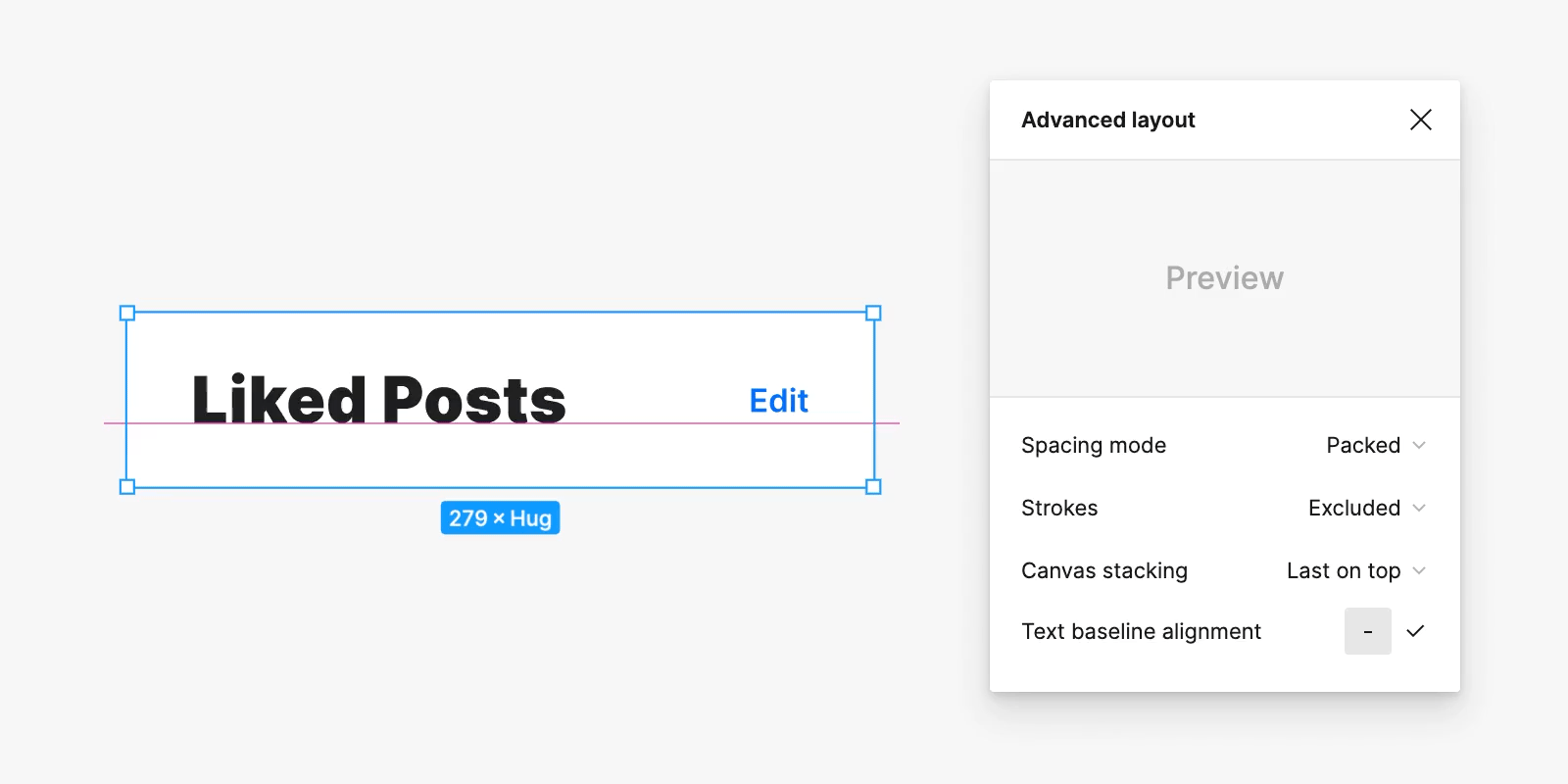
Note that this property is only available when the Direction is horizontal, and any text component is inside the frame.
Some extras you should know
Now that we have gone through all Auto Layout properties, we’ll discuss some additional topics you might be interested in.
Nesting Auto Layout Frames
Many properties are given a single value that is applied to the entire frame, which can be limiting when building layouts. To achieve more complex formatting, you can create one Auto Layout frame inside another, apply different rules to each one, and create more custom layouts. This is what we call nesting frames.
It may seem a little complicated to think of a layer inside another that is inside another, but this technique can be beneficial for you. So let’s see some examples.
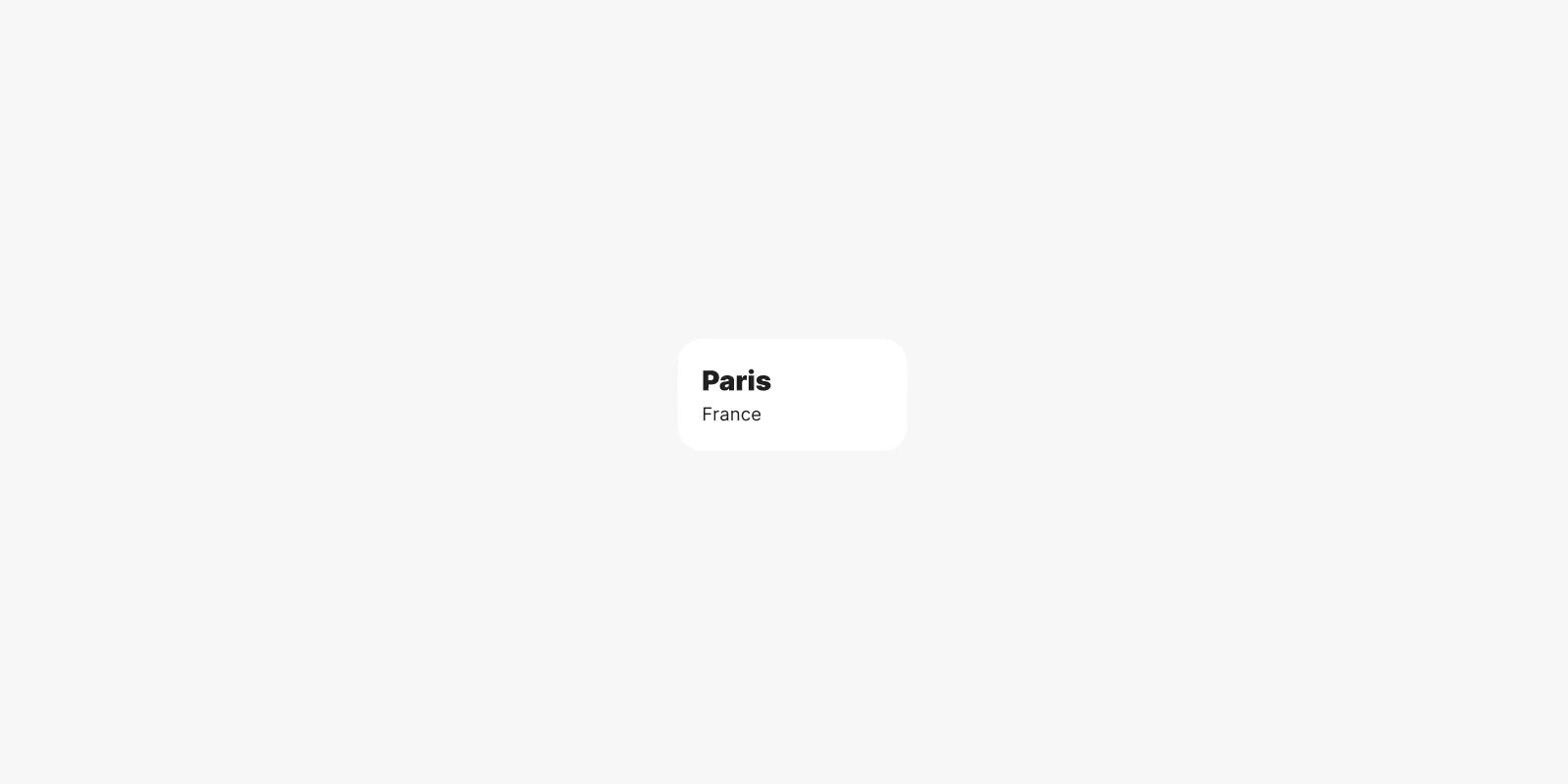
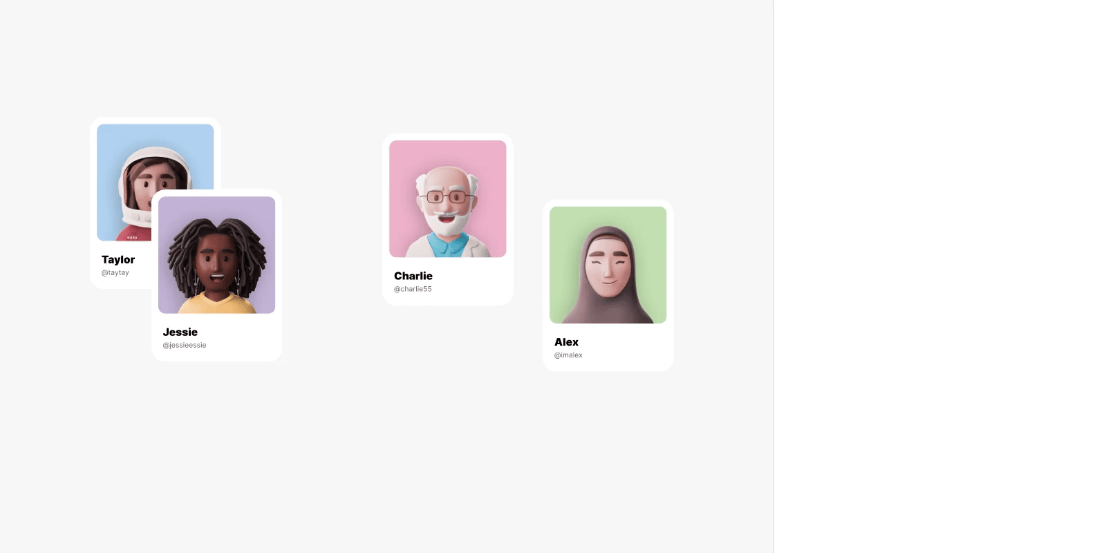
In the component being built below, there is an avatar, a name and a social handle. The name and the social handle are inside an Auto Layout frame, with the vertical Direction. This frame is put next to an avatar, composing a second frame, this time with the horizontal Direction. In this scenario, both frames are nested.

We can also combine some of these components and create a vertical list. This list can also have its own Auto Layout rules, being one more frame inside the nest.

So far, we have one frame inside another, which is inside another. Each one with its own properties.
By making combinations like this, you can imagine the enormous number of possibilities that can be created by nesting frames. This will give you more flexibility when designing complex interfaces without losing organisation and consistency.
What happens with constraints
Now that you’ve mastered properties and nesting, you need to know what happens with regular frame Constraints. Objects inside a frame with Auto Layout can’t have constraints.
Thus, when you enable Auto Layout, you’ll see that Constraints settings will not be available to child elements in the right panel. Instead, to apply sizing and position rules to child components, you must use the Resizing and Alignment properties.
You can still apply constraints to the parent frame, but only if it is inside a regular frame.
Absolute position
And what if Auto Layout seems the best option, but we don’t want all elements to fit the frame rules? Do we need to use a regular frame in this case? Well, believe it or not, combining Auto Layout with independent elements within the same frame is possible through the Absolute Position feature.
Turning Absolute Position on for an object inside an Auto Layout frame will make this object ignore all rules. This means it can be placed anywhere inside the frame. This object will not change size or position according to the defined properties for the Auto Layout, though you can apply regular Constraints in this case.
Now it’s your turn.
Figma has done a great job developing Auto Layout for creating organised and scalable designs. If you’ve got this far in this guide, you already know pretty much everything you need to master this feature and optimise your work.
Now it’s time to put what you’ve learned into practice. Be creative, explore, and have fun!

Article Written by Renata Pôrto – UX/UI Designer from Brazil who loves to create mobile apps, interfaces and design systems with Figma.