

Figma Auto Layout Tutorial: how to design a Task Card
If you’ve ever worked with a task management app, you might have seen cards used to represent tasks, showing details such as title, description, tags, priority level, etc.
Components like Task Cards are great for displaying important information about multiple activities on a board while still allowing team members quickly scan the screen and find what they need.
This article will teach you how to design a Kanban-inspired Task Card using Auto Layout in Figma.
The tutorial is divided into 4 steps, so you can learn how to create some task-related components one by one, and then merge them into an amazing Task Card:
- Step #1: Tag + Priority level
- Step #2: Tile + Description
- Step #3: Assignees + Sub-tasks Counter
- Step #4: Putting everything together and creating the Task Card

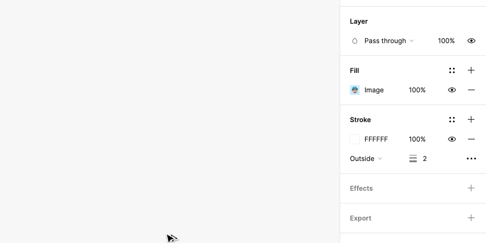
This article mentions properties like Padding, Spacing, Spacing Mode, Resizing, and nesting frames. If you are just starting to learn Auto Layout and/or don’t know some of these features, I’d recommend reading The Definitive Guide to Figma Auto Layout.
Why Auto Layout?
Before we get into the tutorial, let me tell you the benefits of using Auto Layout instead of regular frames or groups.
Auto Layout is a tool that allows you to create dynamic frames that adapt to its content according to the properties you set.
This means that you won’t need to manually adjust your frame every time you make a change in your design. For example, writing longer texts or adding new elements to a card will automatically adjust the component to these changes.

Another advantage is having components that adapt to different dimensions, making it much easier to scale your design to other devices. See that the layout doesn’t break when other sizes are applied; instead, it adapts to the new conditions.

On top of all this, you still guarantee the consistency of margins, spacing, and alignment, among other properties.
This ensures flexibility and scalability without compromising the quality of your designs, especially when collaborating with a team.
That sounds awesome, right? So now that we know some of the benefits of using Auto Layout, let’s move on to the tutorial on creating a Task Card.
Step #1: Tag + Priority

Tag
To get started, we will design a Tag. Start by writing the text for the Tag, then select it and add Auto Layout (Shift + A). This will create an Auto Layout frame that contains your text.
Now it’s time to edit the properties:
- Make sure that the Width and Height of the frame are set to Hug Contents.
- Then, set the Horizontal and Vertical Paddings.
- Apply colours, font styles and corner radius to style your Tag as you like.

Here are the settings I’ve applied to my Tag component:

Priority
Now let’s move on to the task Priority. In this component, we will need an icon and text. Put them together and apply Auto Layout. Once again, a frame will be created with the elements you just made.
Then, adjust the Auto Layout properties for the Priority component:
- The Direction should be Horizontal.
- The Width and Height should be set as Hug Contents.
- Set Paddings to zero.
- And set the desired Spacing.

Here are the settings I’ve applied to my Priority component:

Combine the two
With the Tag and Priority ready, let’s combine the two components in the same frame. Select both, add Auto Layout, and adjust the properties of the new frame:
- The Direction should be Horizontal.
- The Height should be set as Hug Contents.
- Set the Spacing Mode to Space Between. You can do this by typing “Auto” in the Spacing input on the right sidebar, or turning this setting on manually in the Advanced Layout menu.
- For now, the Width will be set to Fixed. We’ll go back to this property later on.

And that’s it! Let’s move on to the second part of this tutorial and create the Title and the Description.
Step #2: Title + Description

The second part consists of the Title and the Description of the task. First, create the texts for your Title and Description. Then, select both and apply Auto Layout.
For this part, the settings are:
- The Direction is Vertical.
- Set the Spacing you want.
- The Alignment should be Top Left.
- For both texts, set the Width to Fill Container so the text fills the entire frame width.
- And for the Height, set as Hug Contents for both texts. This way, the Height will be dynamic and adjusted to the content.

Here are the settings I’ve applied to my Title and Description frame:

The second part is ready! Time to make the last piece of the Card: Assignees and Sub-tasks Counter.
Step #3: Assignees + Sub-tasks Counter

Assignees
For the Assignees, take two avatar images and put them together by adding Auto Layout. Set the properties as follows:
- Direction as Horizontal.
- All Paddings as zero.
- Width and Height as Hug Contents.
- And the Spacing with some negative value, so it has an overlapping effect.
Here are the settings I’ve applied to my Assignees component:

Sub-tasks Counter
This component will be very similar to Priority. We will need an icon and some text. Put the two together and apply Auto Layout. The properties on the Sub-tasks Counter are set like this:
- The Direction must be Horizontal.
- Width and Height should be Hug Contents.
- Set the Paddings to zero.
- Set the desired Spacing.

Here are the settings I’ve applied to my Sub-tasks Counter component:

Combine the two
Now, let’s combine the two components into a single frame. Select both, add the Auto Layout, and adjust the properties of the new frame:
- The Direction should be Horizontal.
- The Height should be Hug Contents.
- Set the Spacing Mode to Space Between.
- For now, the Width will be set to Fixed. We’ll go back to this property in the next step.

And with that, you’ve finished building all the components you need to design your task card!
Step #4: The Task Card

Yay! You’ve made it to the final step. Now, let’s assemble everything you designed throughout the tutorial and create the Task Card.
First, select the three frames you created in the previous steps, then add Auto Layout one last time.
This will nest all the elements into a single frame, forming the Task Card. To set the final adjustments on your component, use the following properties:
- The Direction should be Vertical.
- The Height should be Hug Contents so that it can be dynamically adjusted to its content.
- The Width can be set as Fixed, and you should input the desired Width.
- Make sure the Alignment is set as Top Left.
- Set the Spacing to whatever you want.
- Set the desired Paddings.
- Select all child frames and change their Width to Fill Container so that they fill the entire card width.
- Finally, add a background, round the corners, and voilá – the Task Card is ready!

Here are the settings I’ve applied to my Task Card component:

That’s it!
If you’ve made it this far, you already know how to build a Kanban-inspired Task Card using Auto Layout.
Now you can use your imagination to design your own Task Card. Try changing the position of child components, add an image or a progress bar – play around and see what happens.

Article Written by Renata Pôrto – UX/UI Designer from Brazil who loves to create mobile apps, interfaces and design systems with Figma.


